 14 Terms
Home > Terms > English, UK (UE) > Gap logo
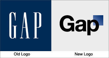
Gap logo
Gap has used the same logo for over 20 years, instantly recognisable with its stretched, white letters against a navy blue background. Yet the company recently released a new logo, created in collaboration with the customer community, to widespread indignation. It has been called a “Microsoft Word” creation and a “prototypical brand panic move”. Gap is already rethinking the change.
This is auto-generated content. You can help to improve it.
0
0
Improve it
- Part of Speech: noun
- Synonym(s):
- Blossary:
- Industry/Domain: Apparel
- Category: Coats & jackets
- Company: Gap
- Product:
- Acronym-Abbreviation:
Other Languages:
Member comments
Terms in the News
Featured Terms

Industry/Domain: Literature Category: Novels
National Book Awards
American literary awards, running annually from 1950 to present. There are 4 awards, fiction, nonfiction, poetry, and young people's literature, with ...
Contributor
Featured blossaries
Browers Terms By Category
- Wireless networking(199)
- Modems(93)
- Firewall & VPN(91)
- Networking storage(39)
- Routers(3)
- Network switches(2)
Network hardware(428) Terms
- Software engineering(1411)
- Productivity software(925)
- Unicode standard(481)
- Workstations(445)
- Computer hardware(191)
- Desktop PC(183)
Computer(4168) Terms
- Biochemistry(4818)
- Genetic engineering(2618)
- Biomedical(4)
- Green biotechnology(4)
- Blue biotechnology(1)
Biotechnology(7445) Terms
- Radiology equipment(1356)
- OBGYN equipment(397)
- Cardiac supplies(297)
- Clinical trials(199)
- Ultrasonic & optical equipment(61)
- Physical therapy equipment(42)
Medical devices(2427) Terms
- Conferences(3667)
- Event planning(177)
- Exhibition(1)